
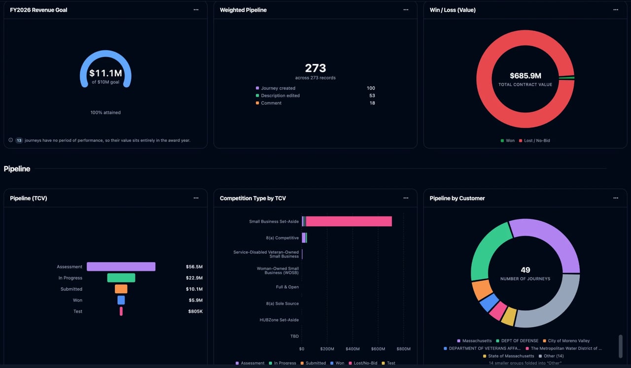
What Reports & Dashboards are
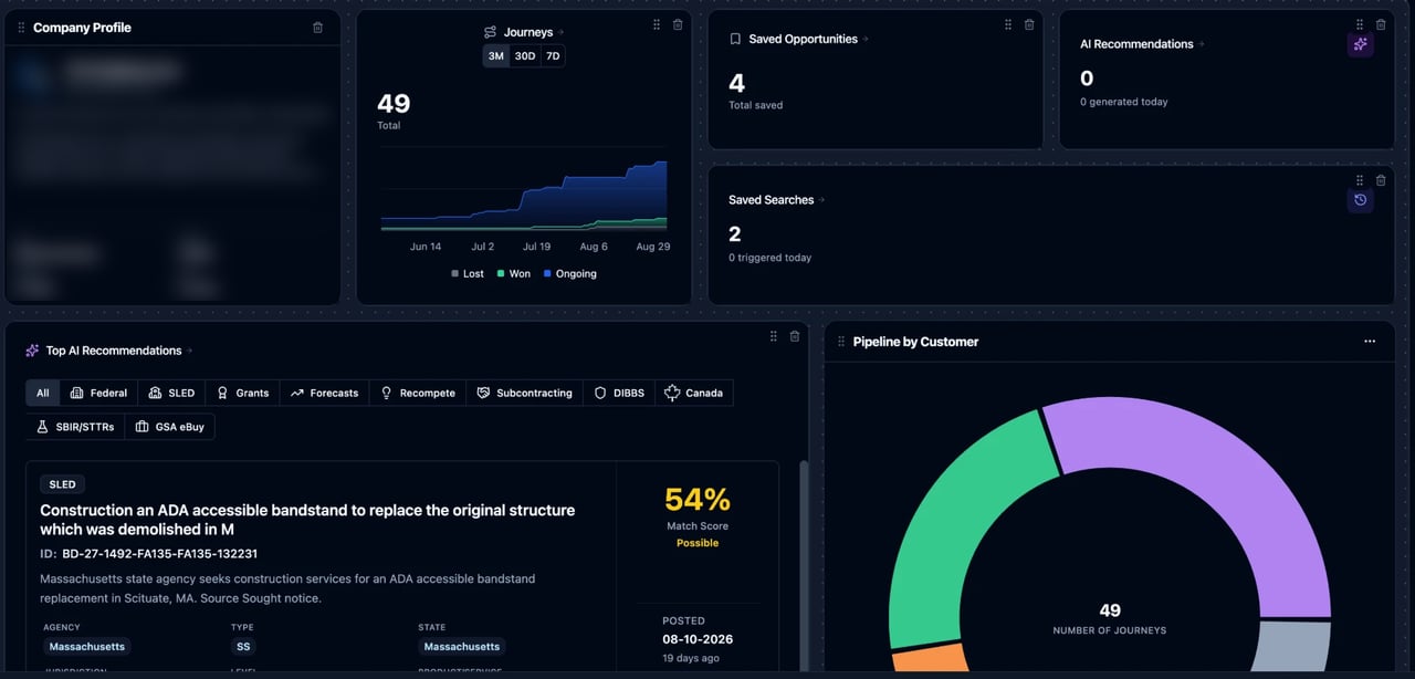
A dashboard is a board of widgets that you arrange on a grid. Most widgets are charts, and each chart answers one question about your data, such as “how much contract value sits in each stage?” or “who is carrying the most open tasks?” A dashboard can also hold section titles, banner notes, and several of the cards from your Home page (recommendations, tasks, deadlines, KPI counts, your Company Profile). Charts run on your live data. Nothing is exported or copied: when a board loads, every chart is calculated from what’s in SamSearch at that moment. Reports & Dashboards is available on paid plans and during a trial.Finding your dashboards
Click Reports in the left sidebar to open the Dashboards page. You can also switch dashboards straight from your Home page:- Go to Home.
- Click the dashboard pill to the right of your greeting. It shows the name of the board you’re looking at, which is Overview (your standard Home widgets) until you pick another one.
- The menu lists Overview plus every dashboard you can see. Type in Jump to a dashboard… to filter the list.
- Click All dashboards at the bottom of the menu to open the Dashboards page.
Creating a dashboard
Click New dashboard on the Dashboards page. You can start two ways.From a template
Under or start from a template, pick a pre-built board. Each template card shows how many charts it contains and a preview of their chart types. Picking one creates a new dashboard that belongs to you, fully built and ready to view. You can then edit it like any other board. The templates are designed around a specific job:Templates aren’t added to your account automatically. A new organization’s Dashboards page starts empty until someone creates a board, either from a template or blank.
Blank dashboard
Type a name under Blank dashboard and click Create blank. The board opens straight into edit mode with the Add to dashboard panel already open, so you can start adding widgets.Viewing a dashboard
An open dashboard shows its name (click it to rename) and a description line underneath (click Add a description to write one). Both save when you click away. The toolbar has:- Refresh: re-runs every chart on the board against your latest data.
- Edit: switches to edit mode so you can move, resize, add, and remove widgets.
- Add widget: switches to edit mode and opens the Add to dashboard panel.
Editing a dashboard
Click Edit to enter edit mode. The board gets a dotted grid background and the toolbar changes to Add widget, Cancel, and Save.- Move a widget: drag it by the grip handle next to its title. Other widgets shift down to make room.
- Resize a widget: drag its bottom-right corner.
- Duplicate or remove a chart: open the chart’s ⋯ menu and choose Duplicate or Remove. Titles, banners, and Home cards have their own remove control.
- Edit a title or banner: type directly into it.
- Set the time window: use the control at the top of the board (see Time window).
Adding widgets
The Add to dashboard panel docks to the right of the board, so the board stays visible and updates as you add things. Drag any item onto the board to place it exactly where you want, or click it to add it to the end of the board. The panel contains:- Generate with Sammy: opens Sammy with a prompt to help you build a chart. Describe what you want to see and Sammy builds it (see Building with Sammy).
- Build from scratch: adds a blank chart and opens its settings so you can choose the data, grouping, and chart type yourself.
- Search charts and templates: filters everything in the panel.
- Layout: a Title (a section heading) and a Banner (a note or callout for the team).
- Home cards: grouped as Recommendations, Saved opportunities, Journeys, Tasks & deadlines, Stats, and Company Profile. These are the same cards you can place on your Home page, plus a Company Profile card (name, website, UEI, and CAGE) and a Certifications card.
- Your charts: charts your organization has already saved that aren’t on this board yet.
- Chart templates: ready-made charts, grouped by topic. Clicking one creates the chart and adds it to the board.
Editing a chart
Open a chart’s ⋯ menu and choose Edit to open the Edit chart panel. Every change updates the chart on the board as you make it.Edits in this panel apply to this card only. If the same chart appears on another dashboard, that copy doesn’t change. As with the rest of edit mode, click Save on the board to keep your changes.
Chart types
Single Metric shows one large total, with the top few groups listed underneath. Gauge vs Goal shows the total against the goal you set.
Datasets
The Data picker groups datasets by area. Each dataset shows a one-line description under the picker when selected.
Journeys (Pipeline) is the dataset most charts use. It has one row per journey and offers these measures:
- Number of Journeys
- Total Contract Value
- Weighted Pipeline: value × the stage’s win probability. Stages with no win probability set are left out. See Pipeline Stages for how stage probabilities work.
- Average Contract Value and Largest Contract Value
- Win Rate: Won ÷ (Won + Lost). Open journeys aren’t counted, so 0% can mean you have no decided deals yet.
- Stalled Deals (90d+) and Stall Rate: open journeys that have sat in their current stage for 90 days or more, as a count or as a share of open journeys.
- Overdue Deals and Overdue Rate: open journeys past their proposal due date, as a count or as a share of open journeys.
Contract revenue and period of performance
The Contract Revenue by Period dataset spreads each journey’s value across the months of its period of performance, so revenue lands in the fiscal years when the work is actually performed. This is what the Contract Waterfall, revenue goal, and coverage charts use. To get accurate revenue charts, fill in the Period of Performance section on each journey’s Overview (base period plus option years, with start and end dates and an optional value per period). A period with no value splits whatever is left of the journey’s deal value with the other periods that have no value. A journey without a period of performance counts its whole value in its award year, and revenue charts show a note saying how many journeys that applies to.Time window
In edit mode, the control at the top of the board sets a time window for the whole dashboard:- All time (no window)
- The current federal fiscal year (for example FY26)
- The next fiscal year (for example FY27)
- The current calendar year
- Custom, which shows a start month and end month
History and trend charts
Most datasets show your data as it is right now. The History datasets show how it has changed over time:- Pipeline Trend (History): the pipeline as it stood at each month end, so you can see whether it’s growing and compare any past month with today.
- Pipeline Changes: one row per stage move, classified as Entered the pipeline, Advanced, Slipped back, Won, or Lost / No-Bid. Use it to see why the pipeline went from one number to another.
- Stage Velocity: how long journeys spend in each stage before moving on, measured as average, median, 90th percentile, or longest stay in days.
- Forecast Accuracy: forecast revenue per fiscal year as it looked at each month end, so you can see whether a year’s forecast is holding up.
History can’t be recovered after the fact. Snapshots start from the day history recording was switched on for your organization and are taken daily, so a new trend chart may show “No history recorded yet” and fill in over the following days. Stage Velocity only counts stage stays that have ended, so it fills in as journeys move on the board.
Pinning a dashboard as your home
Any dashboard can replace the standard Overview on your Home page.- On Home, open the dashboard pill.
- Hover the dashboard you want and click Set home.
Building with Sammy
Sammy can build charts and whole dashboards for you from a plain-language request, such as “chart our pipeline by agency” or “build me a win/loss dashboard”.- A single chart: Sammy shows a preview of the chart in the conversation. Click Save report to save it to your organization’s charts, or Add to dashboard to add it to a board you choose.
- A whole dashboard: Sammy shows a preview of the full board. Click Save dashboard to create it. If you asked for it to become your home page, Sammy can save it and set it as your home, with an option to undo.
- Changing a dashboard: when a dashboard is open, Sammy knows which one you’re looking at, so you can ask it to add, remove, or rearrange charts on that board. Review the preview and click Update dashboard to apply it.
Sharing and visibility
Dashboards and charts belong to your organization and to the active AI Profile. Everyone in your organization working in that profile sees the same dashboards on the Dashboards page and can open, edit, rename, and delete them. There’s no private or per-person sharing setting for dashboards in the app today. The only personal setting is which dashboard is pinned as your home page.Deleting a dashboard
On the Dashboards page, hover a dashboard card, open its ⋯ menu, and choose Delete dashboard. Deleting the board doesn’t delete the charts on it, which stay available under Your charts in the Add to dashboard panel. Because dashboards are shared with your organization, deleting one removes it for everyone.Tips
Start From a Template
Templates are the fastest way to a useful board. Create one, then remove the charts you don’t need and add your own.
Set Your Revenue Goal
The revenue goal gauge in the templates uses a placeholder goal of $10M. Edit the chart and change Goal to your own target, and update its fiscal-year filter each year.
Fill In Period of Performance
Revenue and waterfall charts are only as good as the periods of performance on your journeys. Add base and option periods to your larger journeys first.
Set Stage Win Probabilities
Weighted Pipeline leaves out stages with no win probability. Set one on every stage you want counted in the weighted number.
Use Show Top for Busy Charts
Charts grouped by customer, incumbent, or NAICS can have dozens of groups. Set Show top to keep the largest and fold the rest into Other.
Pin the Board You Check Daily
Set your most-used dashboard as your home so it’s the first thing you see when you sign in.
FAQ
Why is my Dashboards page empty?
Why is my Dashboards page empty?
Dashboard templates aren’t added to your account automatically. Click New dashboard and pick a template, or create a blank board.
If I edit a chart on one dashboard, does it change on other dashboards?
If I edit a chart on one dashboard, does it change on other dashboards?
No. Changes made in the Edit chart panel apply only to that card on that dashboard.
Why is my trend or velocity chart empty?
Why is my trend or velocity chart empty?
History charts use snapshots that start from the day history recording was switched on and are taken daily, so they fill in over time. Stage Velocity only counts journeys that have left a stage. See History and trend charts.
Why is my Weighted Pipeline lower than my Total Contract Value?
Why is my Weighted Pipeline lower than my Total Contract Value?
Weighted Pipeline multiplies each journey’s value by its stage’s win probability, and leaves out stages that have no probability set. Total Contract Value counts every journey at full value.
Why does most of my revenue show up in one fiscal year?
Why does most of my revenue show up in one fiscal year?
Journeys without a period of performance count their whole value in the award year. Add base and option periods on the journey’s Overview to spread the value across the years the work is performed.
Can other people see my dashboards?
Can other people see my dashboards?
Yes. Dashboards are shared with everyone in your organization working in the same AI Profile, and they can edit or delete them. Only your home-page pin is personal.
Are the numbers live?
Are the numbers live?
Yes. Each chart is calculated from your current data when the board loads. Click Refresh on an open dashboard to recalculate it.
Do deleted journeys still count in Reports?
Do deleted journeys still count in Reports?
Not by default. When you delete a journey it disappears from Journey Hub for good, but SamSearch keeps its record for reporting. Turn on Include archived journeys in a chart’s settings to count deleted journeys in your totals.